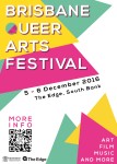
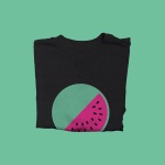
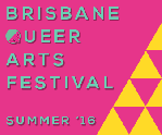
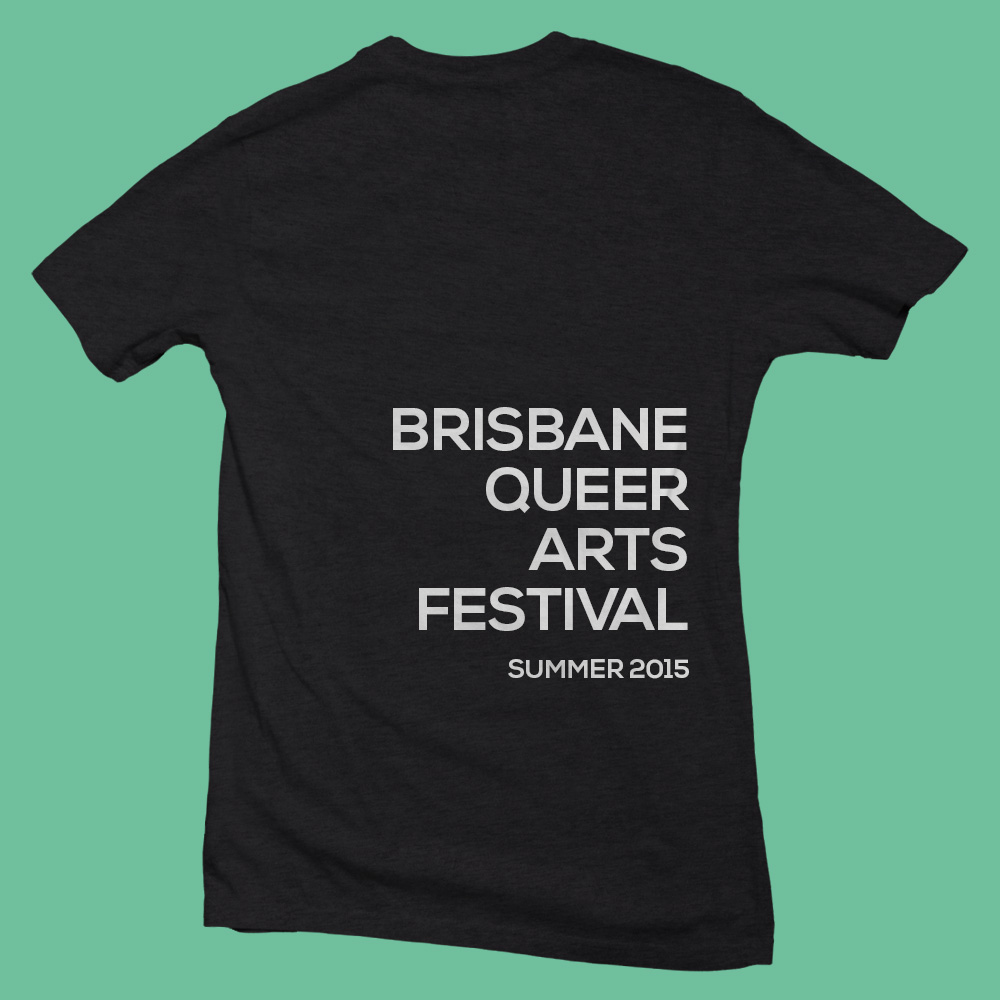
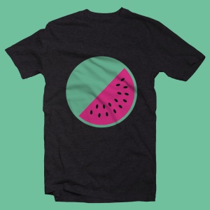
We’re almost halfway through our second project!! Where has the time gone? But that’s what the studio unit is all about – short turnaround time between projects (what it’ll be like in the real world). I think we’re on track though. We have a colour scheme (pink, yellow and green/Aqua), we have logo mockups, we have templates for all our deliverables and everything is well underway. Just trying to get enough things together for the Gallery Walk that’s happening next week. So far I’ve done the mockups for the YouTube pop-up ad and the t-shirt design.

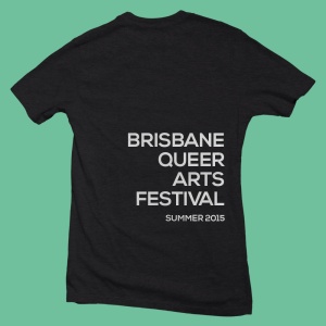
And as a group we’ve been working on the logo, style guide, poster & brochure.

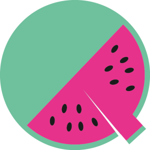
Logo for BQAF – a simple, colourful watermelon to go with the summer theme of the festival.
Group assignments are a funny thing. In our group, we are all doing the work and getting it done but we don’t really have a leader (or a project manager) so for most of the deliverables it’s just been allocated to all of us to work on. Looking back now, I feel like it might have been better to allocate a few more of the deliverables to each of us. Mostly because it’s sort of what happened in the end, it just took a bit of time to get there. I felt like some of the time I was just sitting there not doing anything so I just started working on a deliverable that we hadn’t started yet. Whereas, if from the beginning we had allocated more of deliverables, I could’ve been working on them sooner. This is mostly my fault though because I’m pretty quiet (yes, I’m an introvert) and I don’t speak up a lot. But I am working on it.
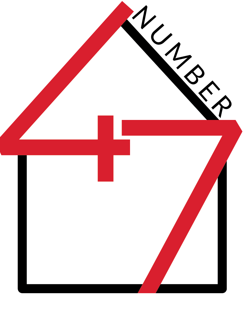
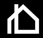
On another note, recently I was approached to design a logo (a friend passed my name onto her friend because he was looking for a designer) so that’s pretty cool. The business is called Number 47 and it’s a community home owned by The Salvation Army in Ryde, NSW.
I sent through a design brief to the client to get the information I needed to start working on the designs. This included general information about the business, the IDENTITY (colors, message, etc.), BRAND CHARACTER (adjectives to describe the business) and some examples of logos he likes.
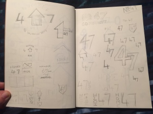
I’ve done up a number of rough thumbnail sketches, picked four that I liked and drew them up on a larger scale and am about to send them through to the client.
Here’s what I’ve done so far, just a little bit of my process:
Research


Also see this Pinterest Board for more inspiration.
Thumbnail sketches
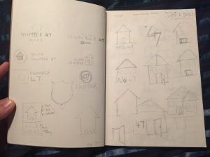
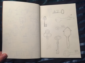
Final choices I’m sending through to my client.
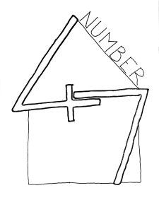
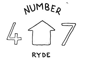
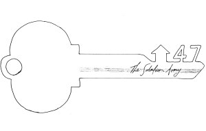
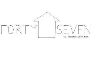
(I haven’t added Colour to the designs yet but the colour scheme will bemostly red and white).
So far throughout my dealings with this client I’ve realised that I really need to work on my communication skills. I take too long to reply to emails and I think sometimes I’m a little bit too casual when communicating. I know communication is vital to the success of graphic design projects because it can help me stay on track and make sure that what I’m working on is what the client is looking for in the design. But it’s a good thing I know it’s an issue and I’m also working on this too.
Feel free to leave me comments or feedback. I won’t mind…
Cheers 🙂
– KH